← Back to Work
UX Research + Usability Testing GIT542 · 2022 · Solo Project

Blush & Bones —
Usability Study

A full UX research sprint on a real Indian jewelry e-commerce platform, from heuristic evaluation and user interviews to moderated usability testing and a redesigned prototype.

Role
UX Researcher & Designer. Solo
Timeline
6 Weeks, 2022
Method
Nielsen's 10 Heuristics
Tools
Figma · Miro · Adobe XD

The Problem

Beautiful products, buried by bad UX

blushandbones.com had a passionate founder and a stunning curated collection of Indian jewelry, but redundant search, no sort or filter, broken social media links, and zero delivery estimates were costing real customers. I treated it as a live research lab.

10
users interviewed about shopping behaviors
9
usability tasks across 3 scenarios
7
usability issues identified and resolved

User Personas

Three archetypes from real interviews

SL
Subha Lakshmi
32 · Web Developer · New Jersey
Wants style tips, AR product view, and outfit ideas before purchasing.
DM
Deekshitha Madhupathi
34 · Data Developer · Florida
Needs clear checkout, customer service, and proper product information links.
PS
Power Shopper
28 · Frequent online buyer
Expects fast search, reliable filters, and trusted reviews before buying.

The Process

Full research sprint in six weeks
Evaluate
Nielsen's 10 heuristics, 3-tier severity scale
Applied all 10 heuristics with Minor → Serious → Catastrophic severity ratings. Issues flagged across visibility, consistency, error prevention, and flexibility.
Research
10 interviews, 3 personas, user stories with acceptance criteria
Dual approach, users familiar with the site gave specific feedback; unfamiliar users provided broader e-commerce behavior insights.
Test
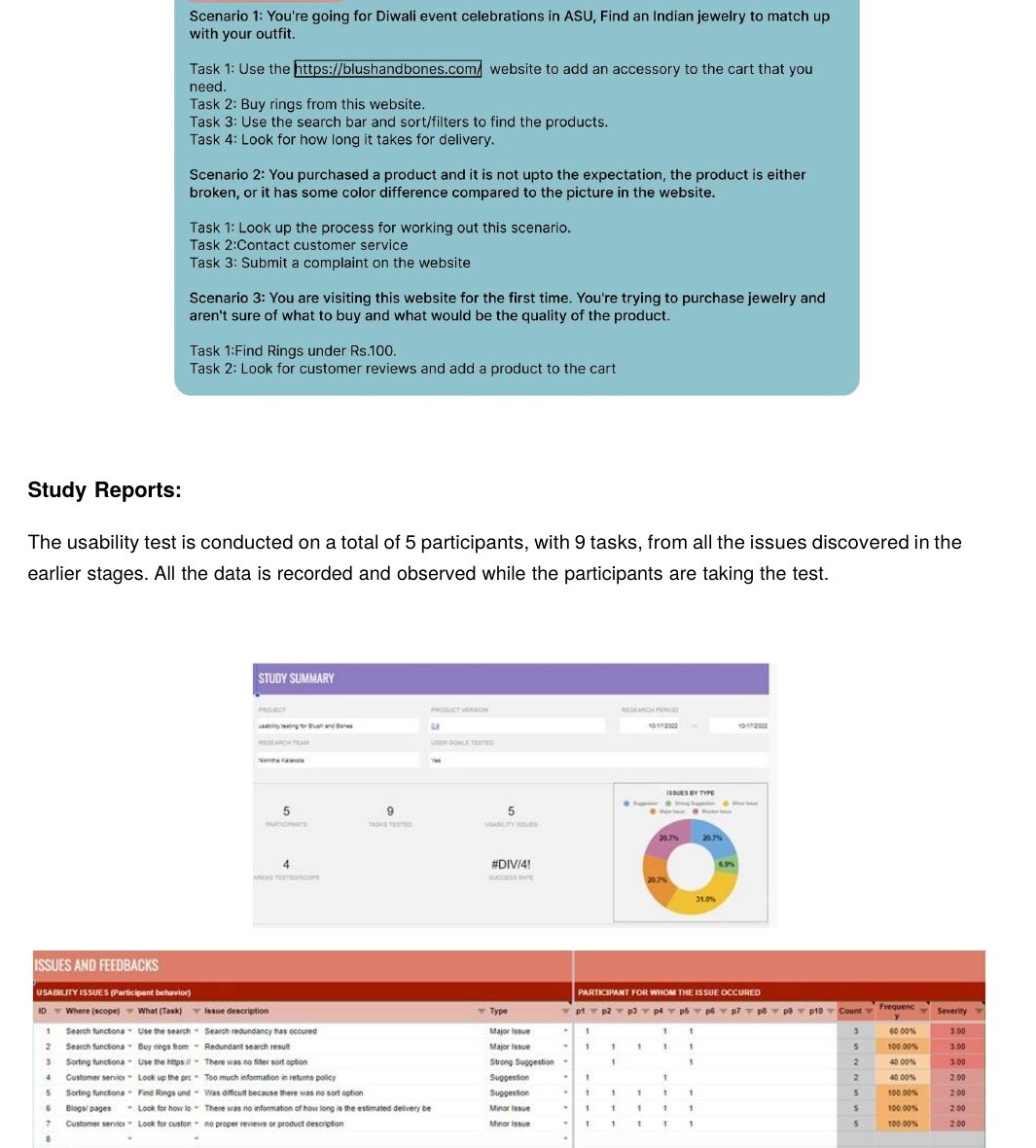
Moderated usability testing, 3 scenarios, 9 tasks
Diwali shopping · returns & complaints · first-time purchase. 5 participants, recorded task times, completion rates, and emotional reactions in real time.
Redesign
5 working prototypes delivered
Smart category search · Sort & filter (price, color, size, type) · Linked social pages · Delivery time estimates · Customer review system with reward incentives.
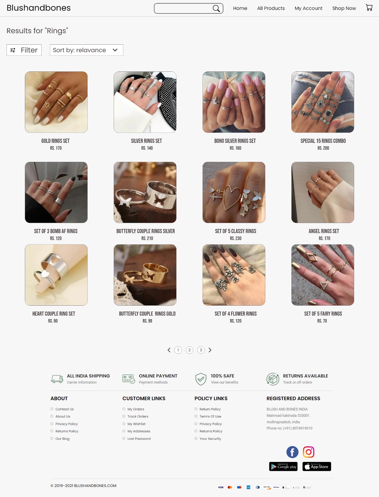
Before · 2022 Blush & Bones 2022 rings results page — no sort feedback, dated layout

Original site — dense grid, no filter state shown, basic sort dropdown
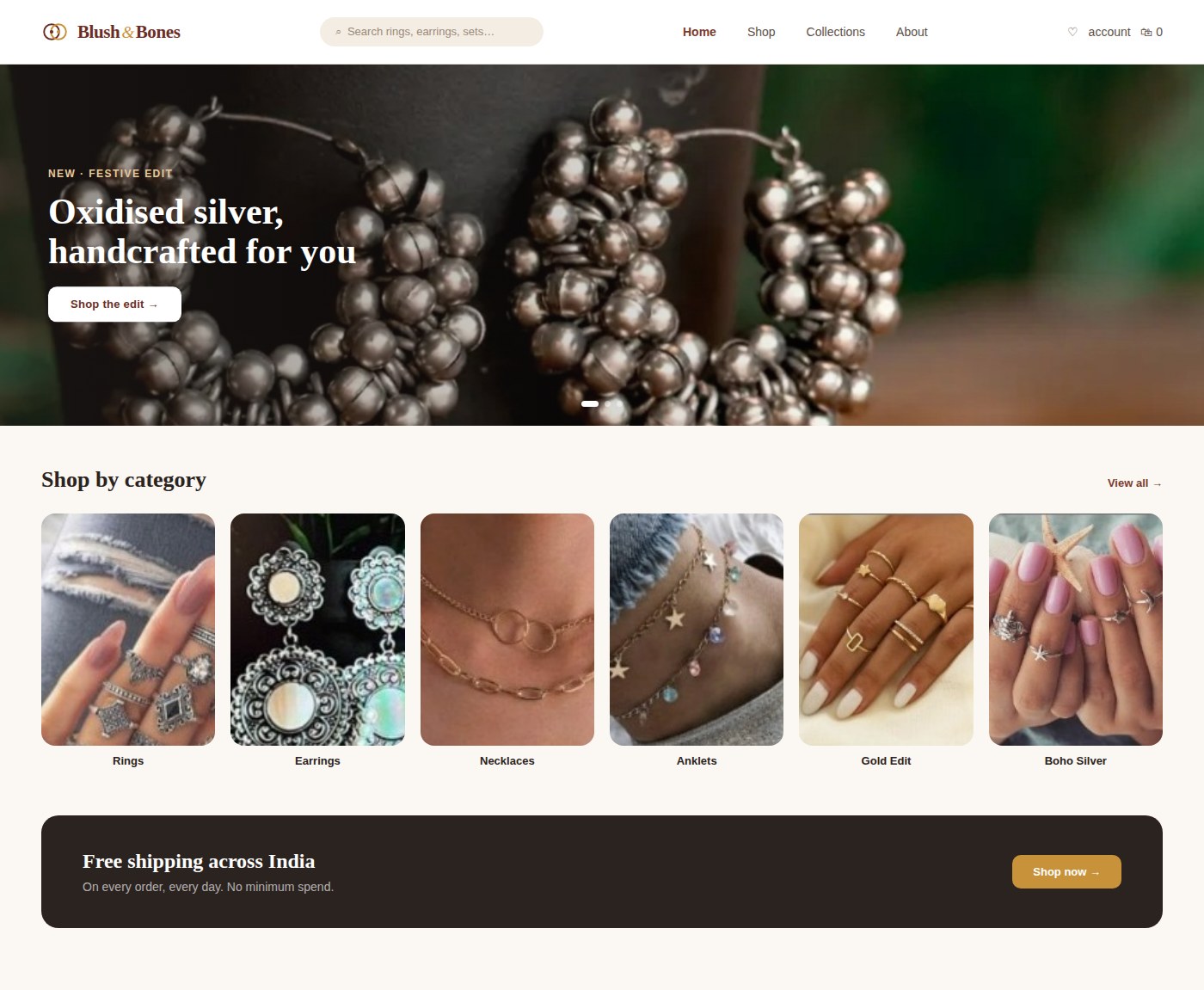
After · Redesigned 2026
Screen 1 of 5 · Home
Redesigned 2026 Blush & Bones homepage with new logo and hero banner
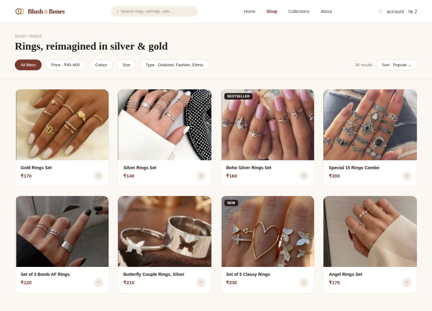
Redesigned 2026 rings results page with filter chips, sort, badges and wishlist
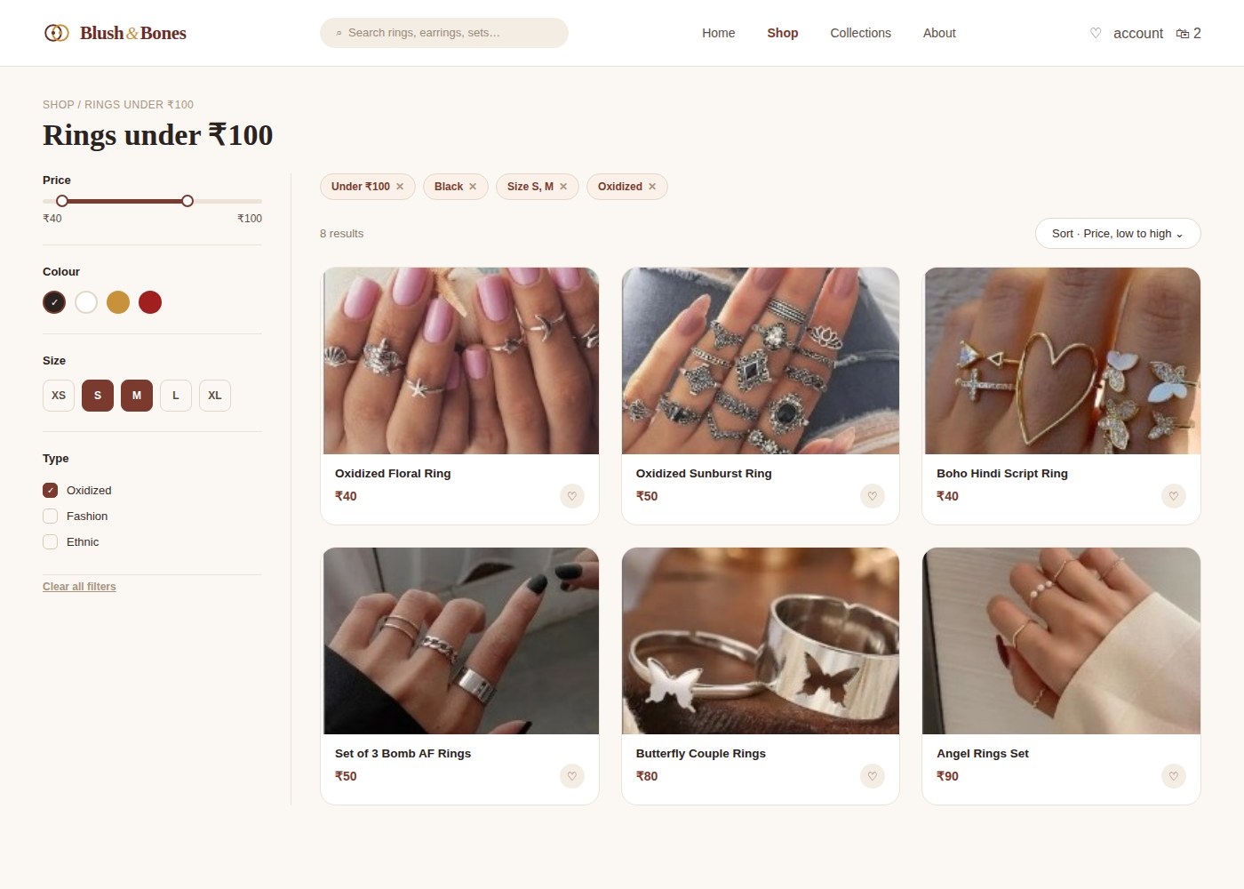
Redesigned 2026 filters applied screen with active filter pills and live results
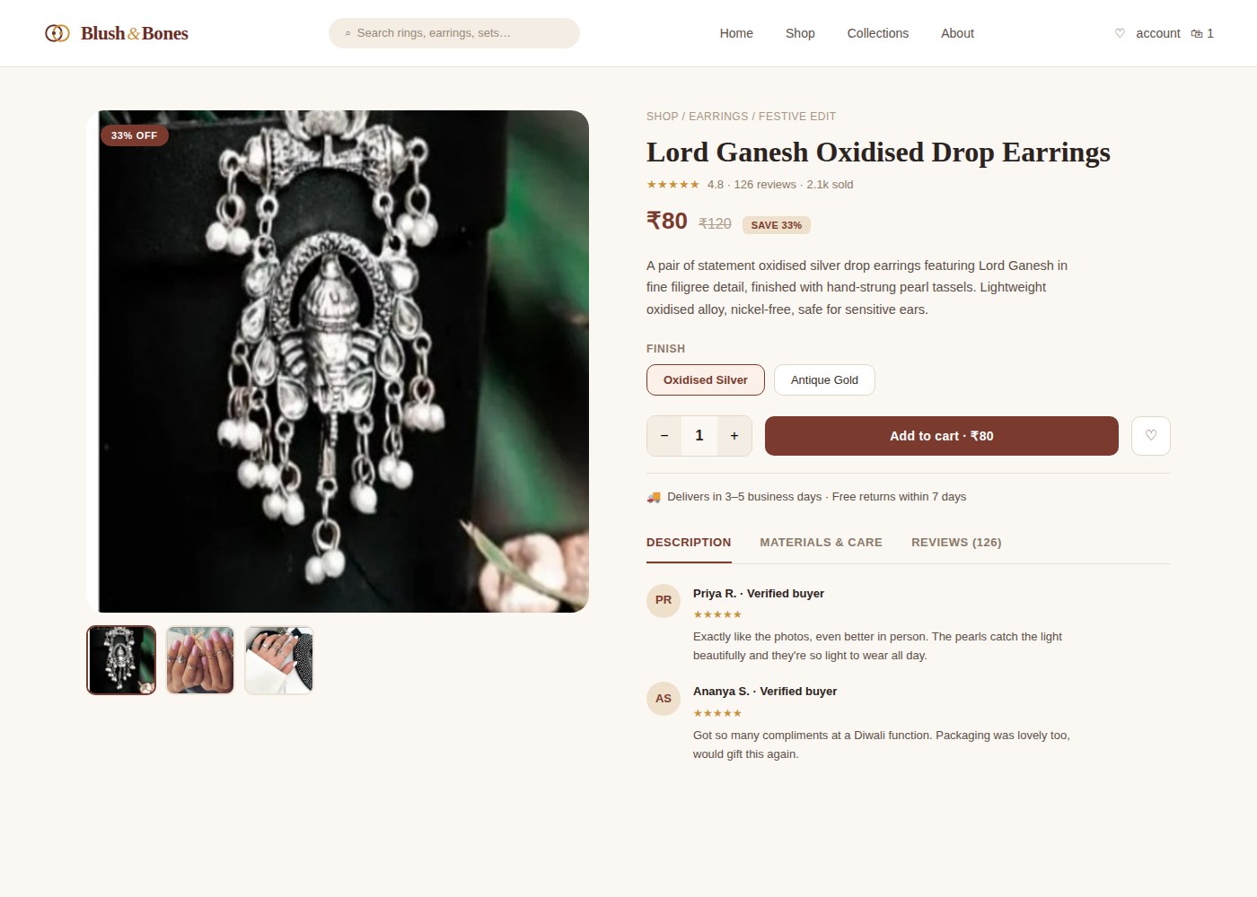
Redesigned 2026 product detail page with ratings, finish options and reviews
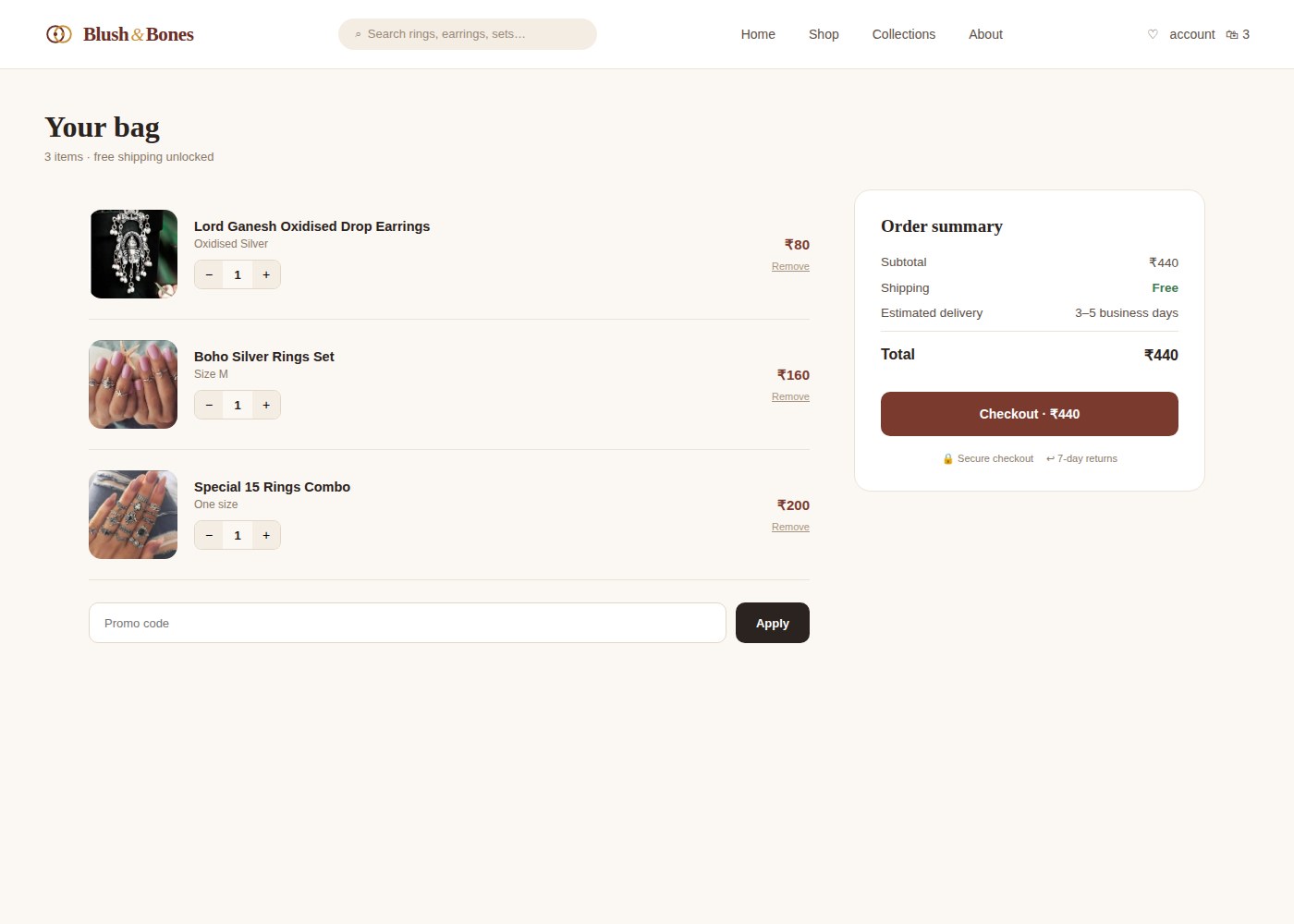
Redesigned 2026 cart page with order summary and checkout

Redesigned concept — new logo, filter chips, live result counts, badges, and a streamlined checkout. Slide through all 5 screens →

Issues Found

7 issues, all resolved

IssueSeverityFix Delivered
Redundant search giving irrelevant resultsMajorCategory-based smart search
No sort or filter options in categoriesMajorSort + filter by price, color, size, type
Social media links lead to empty pagesStrongLinked to active FB and Instagram
Too much information in returns policyMinorSimplified policy with clear sections
No estimated delivery time shownMinorDelivery estimate added to product pages
No customer reviews or product descriptionsMinorReview system + reward incentives
Blush & Bones usability study report dashboard

Usability testing study summary — 5 participants, 9 tasks, issues and frequency analysis

Outcome

"7 usability issues identified and resolved. Post-redesign: 5 of 9 tasks reached 100% completion rate. Core shopping flows fully resolved."

GIT542, UX Research Process, ASU

Completed · GIT542

Revisiting the Redesign — 2026

Translating the 2022 fixes into a modern visual language

The original recommendations still hold, smart search, sort and filter, reviews, delivery transparency, but I revisited the visual execution against 2026 UI conventions: a redrawn logo, pill-shaped filter chips, soft neutral palettes, real-time result counts, and a product page built around trust signals like verified reviews and clear return windows. The full 5-screen redesign is in the slider above, screen 4 is the rebuilt product page shown below for direct comparison.

Before · 2022 Blush & Bones 2022 product page for Lord Ganesh earrings — bold condensed type, single review line
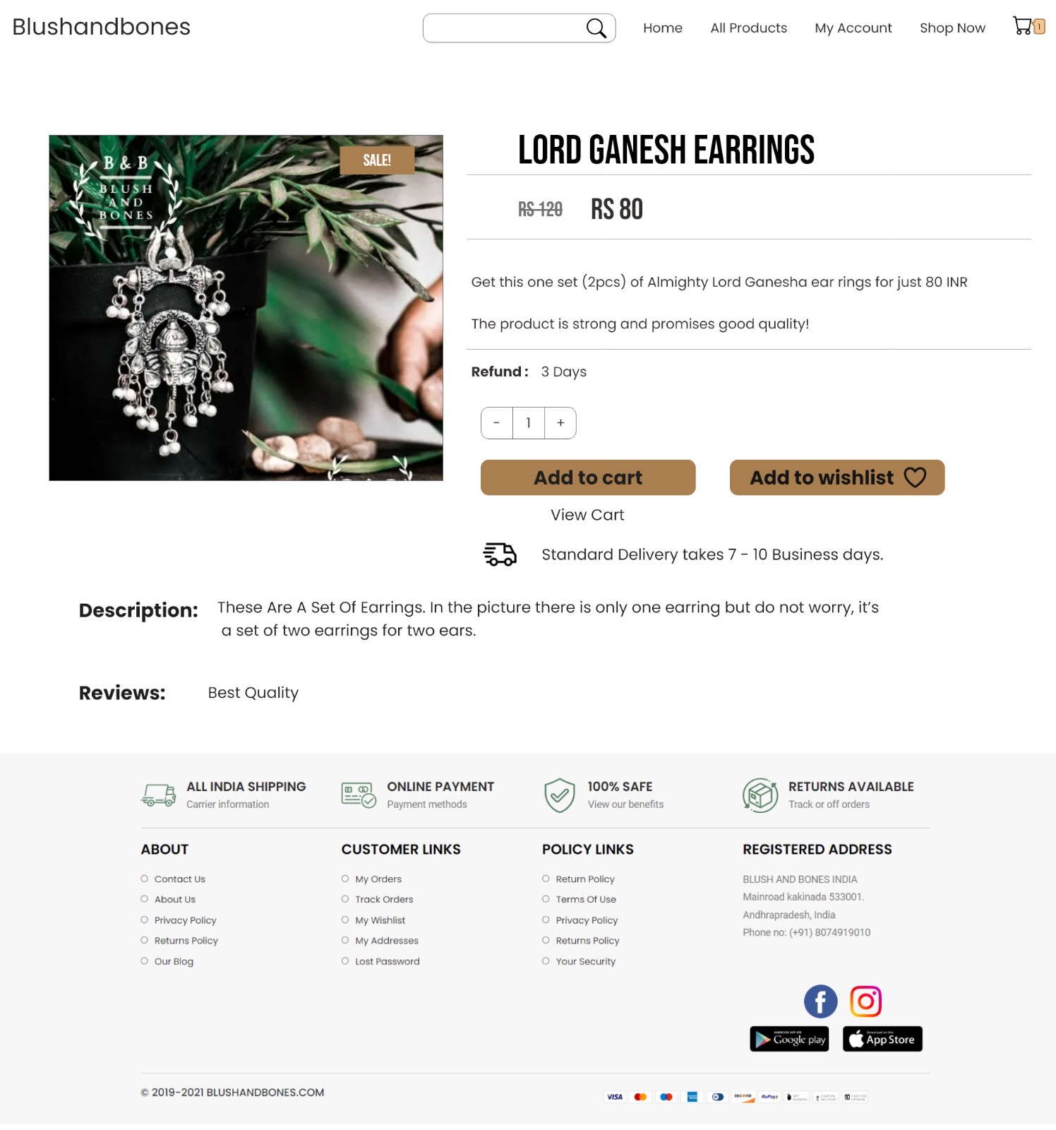
Original product page — condensed display type, no size/material info, single-line review

After · Redesigned 2026 Redesigned 2026 product page with finish options, ratings breakdown, and verified reviews

Redesigned concept — finish options, star ratings, savings badge, verified buyer reviews

Previous
← Reimagining the To-Go Box
Next Case Study
Molly Moon's Brand Design →